Iterative design & improvements
We have a huge application, which contains a lot of pages, functions and user journeys.
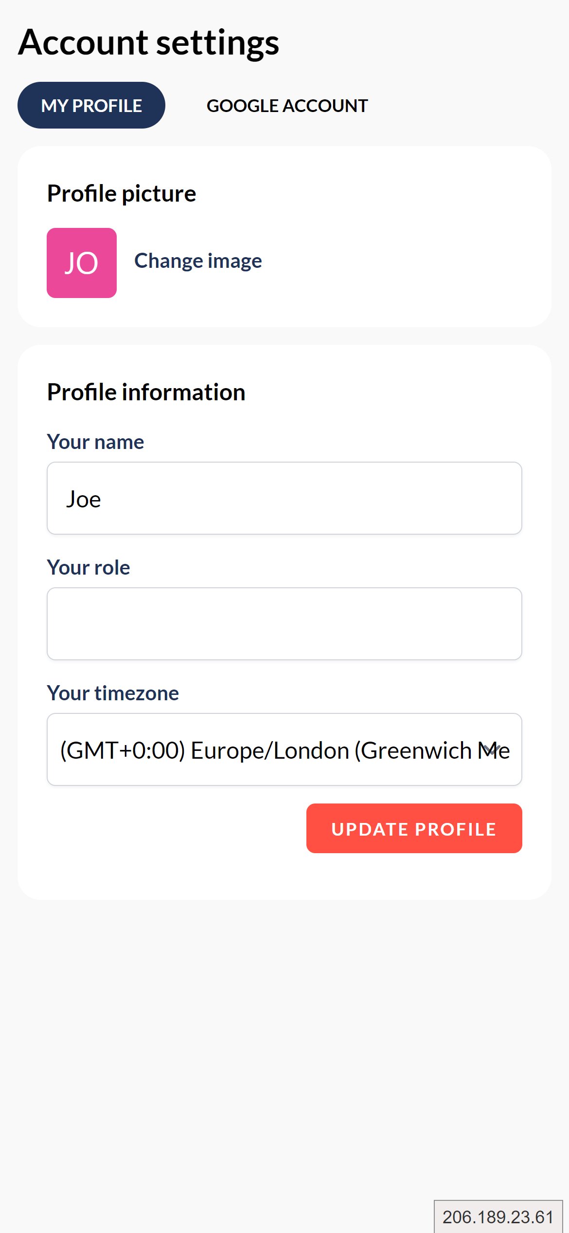
Recently, I've been paying attention to the UX for the smaller less common pages, and recently, the biggest focus has been on the user settings page.
Here's before and after - let me know what you think!
Before

After
Trending on Indie Hackers

You need to increase the contrast. Light grey on white is hard to see. I really like the colors, but you should really consider borders and maybe shading for all white/grey elements.
Thanks for the feedback bud :)
That's something we're actually addressing at the moment - our design system needs a little bit of work to increase visual hierarchy, and a part of that is looking at card contrast.